
The question pops up in a LinkedIn thread roughly every other week. Someone needs a website: a portfolio, a page for the new one-person company, something to sit at the end of a link in an email signature. And so they ask: Squarespace or WordPress?
The answers roll in, and they’re always the same four. Squarespace if it needs to look good. WordPress if it needs to do things. Wix if it needs to be cheap. Or: my cousin can build it for fifteen thousand kroner.
All four answers rest on the same assumption. That you have to choose between a template and a developer.
That assumption held until about a year ago.
The third option
You can ask an AI to build the site. Not an AI that generates a page inside a platform you rent space in, but an AI that produces real files, sitting in a folder on your computer, that you can put on the web wherever you like.
It’s less impressive than it sounds. You write what the site should do. It builds. You look at it and say what’s wrong. It fixes it. After a couple of hours you have a website that doesn’t look like a template, because it isn’t one.
The site you’re reading this on was made that way. The front page, the newsletter archive, the playbook with its five layers, the podcast, the learning platform behind it with login and database. I haven’t opened Squarespace a single time. I also haven’t written much of the code myself. I’ve described, looked, complained and described again.
The cost of running it: a domain at a few hundred kroner a year. Hosting costs zero. The rest is the Claude subscription I already have anyway.
Here’s how you do the same.
Step 0: Pick your tool
There are two places you can sit and do this. The work is the same in both. The difference is what you’re looking at while you do it.
Claude Cowork is an app with your files on one side and a chat on the other. There’s no terminal anywhere. If you’ve never coded, this is your choice. You open the app, point it at an empty folder, and write to it like you would to a colleague.
Claude Code runs in a terminal, that black box of text developers sit staring into. That’s where I build this site myself. Not because it’s better for the job, but because I was already sitting there. If you’ve ever installed something via a command line without breaking a sweat, take this one.
Everything from here works in both. When I write “ask it to”, I mean: type it in the chat.
Step 1: Steal a design before you write a single word
This is the step people skip, and it’s also why their AI-built sites all look alike. Purple gradient, rounded corners, a headline taking up half the screen. Given no direction, the AI goes where everyone else has gone.
So give it a direction before you ask for anything at all.
Find a website you’re envious of. Not one from your industry, one you simply think is beautiful. Refero and Mobbin have thousands of real pages, sorted and searchable. Recent, which until recently was called Godly, has the most gorgeous ones. And Wardrobe UI, which I built myself, has complete design systems you can pour straight into an AI.
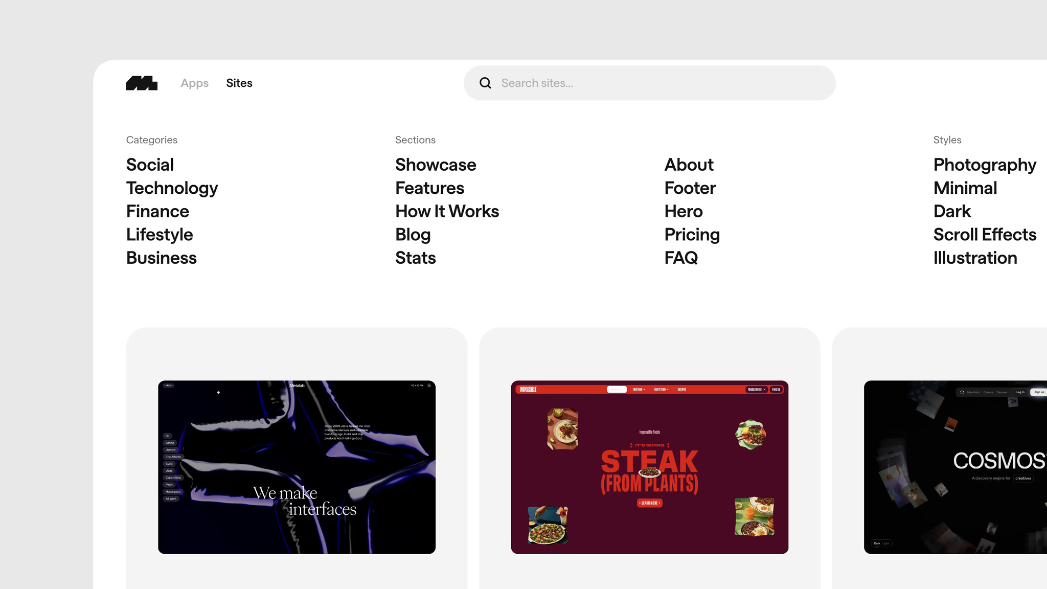
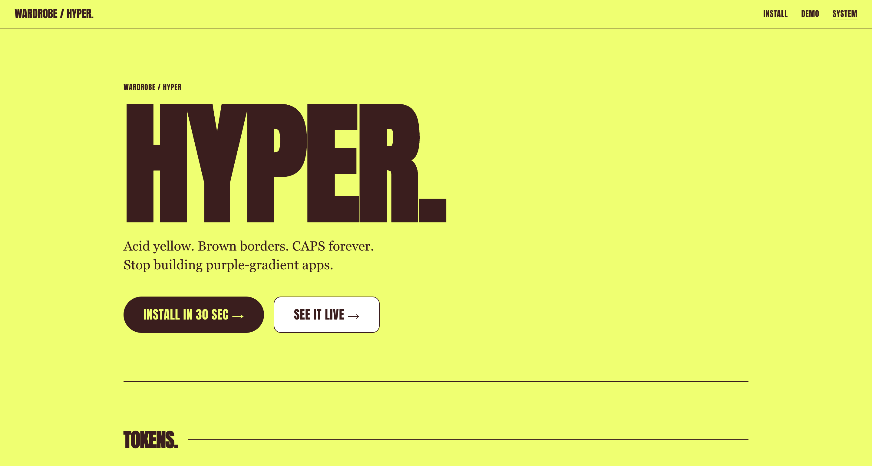
Once you’ve found it, you write:
Look at the design at [URL].
Describe the typography, the color palette, the spacing
rhythm and the component style. Create a file called
DESIGN.md with those rules, so we can build my site in
the same language.
Now you have a design system. It took you three minutes, and you didn’t make a single aesthetic decision yourself. There’s a ready-made skill for exactly this step. It’s called extract-design-system. But the prompt above does the job fine without it.
Step 2: Write ten lines about who you are
The next thing it’s missing is you. Not your life story, just enough for the page to have a point.
I need a personal website.
My name is [name] and I [what you do].
People land on the site because [why they google you].
When they leave, they should [what you want them to do].
The site needs: front page, about me, [the rest].
The language is English. Follow DESIGN.md.
Ask me the questions you need answered before you build anything.
That last line is the most important one. Without it, the AI dives in and builds the wrong thing in a nice design. With it, you get five questions back that you actually have to answer, and half of them are questions you hadn’t asked yourself.
Step 3: Lock the design before you build further
Here’s the mistake I made myself for months. I built a page, liked it, built the next one, and suddenly the buttons were a different gray and the headlines sat somewhere else. AI drifts. Every time you ask for something new, it guesses a little again.
The solution is boring and it works: write the rules down and point to them every time.
Mine live in a file called CLAUDE.md, which gets read every single time I open the project. One typeface, no others. Black text, yellow accent color, and yellow may appear in at most five places on a page. Sharp corners, no rounding. No italics anywhere. Hairline rules instead of boxes.
You don’t need my rules. You just need some.
Put these rules in DESIGN.md and follow them in everything
you build from now on. If you're unsure about a color or a
spacing, ask instead of guessing.
Step 4: Build one page. Not the site
Ask for the front page. Only the front page.
The reason isn’t technical. It’s that you don’t know what you want until you see something. If it builds eight pages at once, you have to give feedback on eight pages at once, and then you give no feedback at all. You say “fine” and live with it.
One page. Look at it. Be dissatisfied. Then you build the rest on top of something you actually like.
Step 5: Fix things by pointing
You don’t need to learn design vocabulary to fix something. Say it the way you’d say it to a person standing next to you, looking at the screen:
The headline takes up too much space. There’s too much air under the image. The button disappears, make it the yellow one. This paragraph is boring, write it like you’re telling it to a friend. Show me three ideas for what the menu could look like.
That last one is the one I use most. Ask for variants instead of fixes. It’s faster to point at the best of three than to explain what’s wrong with one.
Step 6: Put it on the web
This is the part people fear most, and it takes ten minutes.
I use Netlify. You create a free account, and then you ask:
Deploy this site to Netlify.
Tell me exactly what to click along the way.
Then you get an address with something cryptic in front of netlify.app. It works, it’s live, you can send it to your mom. After that, you buy a domain. I use one.com, Netlify can also sell you one. Then you ask for help pointing the domain to the right place. It’s two fields to fill in.
The alternatives exist and are just as good: Vercel, Cloudflare Pages, GitHub Pages. Pick Netlify unless you have a reason to pick something else. The reason I mention it: the free tier is more than enough for a personal site, and you can move the whole thing away again the day you want to. You can’t do that from Squarespace.
Step 7: Three things that lift the result
Skills are small packages of knowledge you install once, which the AI draws on without you asking. These three are the ones that move the most for a non-technical person:
Superpowers forces it to think before it builds: idea, spec, plan, and only then code. It’s the difference between a colleague who asks and one who just starts. Two lines to install in Claude Code:
/plugin marketplace add obra/superpowers-marketplace
/plugin install superpowers@superpowers-marketplace
UI/UX Pro Max gives it a searchable database of design styles, color palettes and font pairings. It’s the insurance against your site ending up in the default aesthetic anyway.
Impeccable is a design detector. It goes over your changes with a fine-tooth comb and complains when something is off, before you notice it yourself. I have it running on this site, and it catches things I walk past every day.
If you’d rather watch someone do it first
There are a thousand YouTube videos with titles like “I built an amazing portfolio in four minutes”. Most are ads dressed up as tutorials. Three places I can actually vouch for:
Anthropic’s own guide takes you through five steps from description to deployed page. Short, official, and it ends up in the same place as mine: at Netlify.
Oliur’s beginner guide is written by a designer who openly says he can barely code. He puts his site on Hostinger instead, but the rest is the same.
Boris Cherny: Mastering Claude Code in 30 Minutes is the only video here. Cherny is the person behind Claude Code, so this is not a retelling. It’s technical, but you come out understanding why things work the way they do.
When you should take Squarespace anyway
I’m not going to sell you something you don’t need.
If you need a real webshop with inventory, payments and VAT, take Shopify. If a client needs to edit text themselves every week without opening anything that looks like code, give them Squarespace and be done with it. And if you just need a link in the air by tonight and never want to touch it again, a template is faster than everything I’ve just described.
But if the site is you, your name, your work, what you want to be known for, it’s odd to pour it into the same template as ten thousand others. And it’s even odder to pay for that every month.
Start here
Open Refero. Find the page you’re envious of. Send the link to Claude along with the sentence: “Build me something that feels like this, but for me.”
You’ll have a front page before dinner. The rest is just pointing at what’s wrong.